Documentation themes where navigation and search outweigh visual decoration
A documentation theme is not a marketing site skin applied to a docs folder. It is a structural tool that determines whether users can find what they need, understand what they read, and navigate between related topics without losing their place. The themes in this collection are built around that priority. They treat navigation depth, search quality, and content hierarchy as primary design decisions and handle visual styling as a secondary concern that supports readability rather than competing with it.
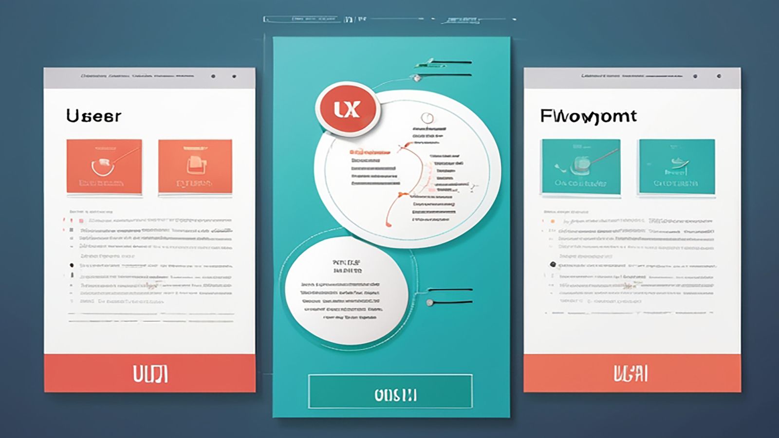
Ace: the reference implementation for documentation that scales
Ace is the lead documentation theme in the Vantage Design catalog. It is built for Hugo and designed around a specific problem: documentation that starts small and grows past the point where a simple sidebar and a search bar are sufficient. When a docs site has eight pages, almost any theme works. When it has eighty, the navigation model, search behavior, and content chunking patterns become the difference between documentation that users rely on and documentation that users avoid.
Ace handles growth by structuring navigation as a multi-level sidebar that supports nested sections without becoming a wall of links. Top-level categories stay visible. Subsections expand on interaction. The current page is clearly indicated, and sibling pages are accessible without scrolling through the entire tree. This sounds basic, and it is, but most documentation themes get it wrong by either flattening everything into a single level or nesting so deeply that users lose context about where they are.
The theme includes a shortcode system that handles the content patterns documentation relies on most: callout boxes, tabbed code examples, parameter tables, and collapsible sections. These are not decorative elements. They are structural tools that make dense technical content scannable. A page that explains an API endpoint needs a parameter table, a code example in multiple languages, and a callout for common mistakes. Ace shortcodes handle all three without requiring the author to write custom HTML.
Why docs navigation and search matter more than ornamental styling
The most common mistake in documentation theme selection is prioritizing visual style over structural capability. A theme that looks clean in a screenshot but collapses when the sidebar has forty entries is not a good documentation theme. A theme with beautiful typography but no search integration is not a good documentation theme. Visual style matters, but it is a secondary concern behind the two things that determine whether docs are actually usable: navigation and search.
Navigation in documentation is a solved problem in theory and a persistent failure in practice. The theory is simple: organize content hierarchically, show the user where they are, and make it easy to move to related content. The failure happens when themes do not support enough hierarchy depth, when the active page indicator is subtle to the point of invisibility, or when mobile navigation is an afterthought that hides the sidebar entirely and provides no alternative wayfinding.
Search in documentation is even more critical. When a user lands on a docs site and knows what they are looking for, they search. If the search is slow, inaccurate, or missing, the user leaves. Ace integrates search as a first-class feature with keyboard shortcuts, result highlighting, and section-aware results that show which part of the documentation hierarchy each result belongs to. This is not a "nice to have" feature. It is the feature that determines whether your docs are a reference users return to or a one-time read they supplement with Stack Overflow.
The onboarding problem: getting new users to the right page first
Documentation themes shape onboarding even when nobody plans for it. The landing page of a docs site is usually the first impression a new user has of a product. If that page is a wall of text with no clear entry point, onboarding fails before it starts. If it surfaces the three or four things a new user needs first (installation, quick start, core concepts, and a working example), onboarding succeeds without requiring a separate tutorial.
Ace supports this with a customizable docs landing page that separates getting-started content from reference material. New users see the onboarding path. Returning users see the reference navigation. Both groups get to the content they need without wading through content meant for the other group. This separation sounds obvious, but it requires the theme to support distinct content zones on the landing page, and most themes provide a single content area with a sidebar.
Beyond the landing page, onboarding depends on content hierarchy. Ace supports front matter that controls page ordering, section grouping, and navigation labels. This means the documentation author can structure the sidebar to match the learning path rather than the alphabetical order of file names. Getting Started appears before Advanced Configuration. Core Concepts appears before API Reference. The theme enforces this ordering consistently without requiring manual sidebar configuration for every page.
Breaking dense content into scannable pieces
Technical documentation is inherently dense. API references include parameter tables, response schemas, error codes, and usage examples. Configuration guides list options with types, defaults, and interaction effects. Tutorials combine explanatory prose with code blocks and expected output. Without deliberate chunking, these pages become walls of text that users scan desperately rather than read productively.
Ace approaches content chunking at two levels. At the page level, the theme uses clear heading hierarchy with visible anchors, so users can link to and jump to specific sections. The table of contents sidebar (separate from the navigation sidebar) provides a page-level outline that updates as the user scrolls, showing them exactly where they are in a long page.
At the content block level, the shortcode system provides structured containers for different content types. Code blocks with syntax highlighting and language tabs. Callout boxes for warnings, tips, and notes. Parameter tables with type annotations. Collapsible sections for content that is important but not needed on every read. These containers give the page visual rhythm and help users distinguish between "code to copy," "information to understand," and "warnings to remember" without reading every line.
The best way to evaluate Ace is to use it. The Ace theme overview shows the theme structure, navigation model, and landing page layout with real content. The shortcodes reference demonstrates every content block type with live examples and the source markup needed to produce them.
If you are evaluating documentation themes for a project that is currently small but expected to grow, Ace is designed for exactly that trajectory. It handles ten pages and a hundred pages with the same navigation model, the same search behavior, and the same content chunking tools. The theme does not need to be replaced when the docs outgrow it, because the structure scales with the content.